Ever wondered how to give a graph a hand-drawn, cartoon-like touch? One option
is matplotlib’s plt.xkcd(), which switches the whole rendering style to
something resembling a sketch.
It is a novelty, but a useful one. The style deliberately signals this is a schematic, not data — which is exactly what you want when illustrating a concept in a talk, where a polished plot invites the audience to read precision into numbers you never measured.
The more durable value of the snippet below is everything around the style call: adding annotations and arrows, shading regions, drawing reference lines and removing axis furniture. Those techniques apply to any matplotlib figure.
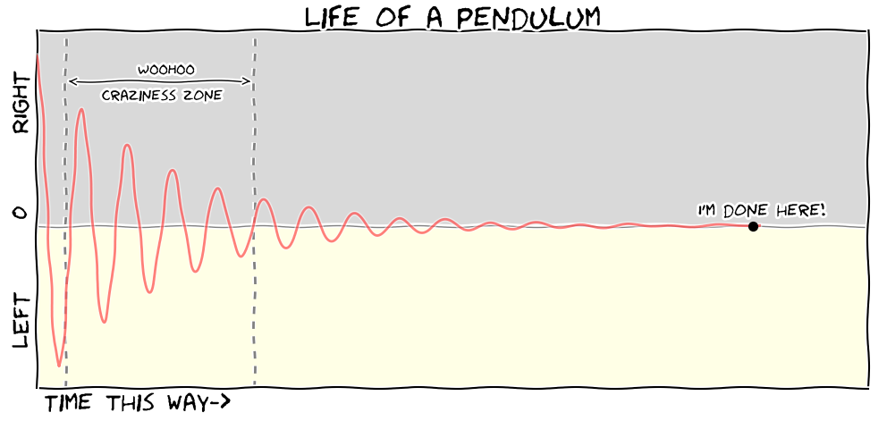
What the code does
The curve is a damped harmonic oscillator, cos(0.5x)·exp(-0.03x), sampled at
ten thousand points. Everything after that is presentation: ticks are cleared
because the exact values are not the point, the positive and negative regions
get different background fills, two dashed verticals bracket a region of
interest, and a double-headed arrow labels it.
# -*- coding: utf-8 -*-
"""
Created on Wed Nov 2 09:32:52 2016

@author: Krzysztof
"""
# import libraries
import numpy as np
import matplotlib.pyplot as plt

# for a comic-like style
plt.xkcd()

# generate 10000 points between 0 and 200
X = np.linspace(0, 200, 10000)

# an equation for a damped harmonic oscillator
Y = np.cos(0.5 * X) * np.exp(-.03 * X)

# make a figure object with axes
fig = plt.figure(figsize=(12, 5), dpi=300, facecolor="white")
axes = plt.subplot(111)

# plot data in red, with opacity, solid line, explicit z-order
plt.plot(X, Y, color='red', linewidth=2, linestyle="-", zorder=+5, alpha=0.5)

# this clears the x and y ticks
axes.set_xticks([])
axes.set_yticks([])

# set limits for the x and y axes
excess = 1.15
axes.set_xlim(excess * X.min(), excess * X.max())
axes.set_ylim(excess * Y.min(), excess * Y.max())

# add a point as a scatter plot, and annotate it
t = [9900]
plt.scatter(X[t], Y[t], s=50, zorder=+12, c='black')
plt.text(X[t[0]] - 15, Y[t[0]] + .05, "I'm done here!", ha='left', va='bottom')

# add the y label
plt.ylabel("LEFT      0      RIGHT", y=.5, fontsize=20)

# add the text for the x axis
plt.text(X[100], Y.min() - 0.15, "Time this way->", ha='left', va='top',
         color='black', fontsize=20)

# shade the positive and negative regions of Y
axes.fill_between(X * 2, 0, Y.max() * 10, color='0.85', zorder=-1)
axes.fill_between(X * 2, 0, Y.min() * 10, color=(1.0, 1.0, 0.9), zorder=-1)

# add vertical lines
axes.axvline(X[400], ymin=0, ymax=Y.max() * excess, color='.5', ls='--')
axes.axvline(X[3000], ymin=0, ymax=Y.max() * excess, color='.5', ls='--')

# annotate the region between the vertical lines, with an arrow
plt.text(X[1400], 0.95, "WOOHOO", ha='left', va='top', color='black', fontsize=12)
plt.text(X[900], 0.8, "craziness zone", ha='left', va='top', color='black', fontsize=12)
plt.annotate("", xytext=(X[400], 0.85), xy=(X[3000], 0.85),
             arrowprops=dict(arrowstyle="<->"))

# add a horizontal line at 0
plt.axhline(color='gray', linewidth=1, zorder=2)

# add the title
plt.title("Life of a pendulum", fontsize=24)

# save a png
plt.savefig("pendulum.png")
plt.show()
Two details worth stealing. The zorder arguments control what sits in front of
what — the shaded fills are pushed to -1 so they stay behind everything, while
the annotated point is lifted to +12 so nothing covers it. And fill_between
is called with X * 2 so the shading runs past the right-hand edge of the axes
rather than stopping short of it.
The xkcd style needs the Humor Sans font to render as intended. Matplotlib will warn you and fall back to a default if it cannot find it, which is worth knowing before you conclude the call did nothing.
Download
python3 pendulum_plot.py